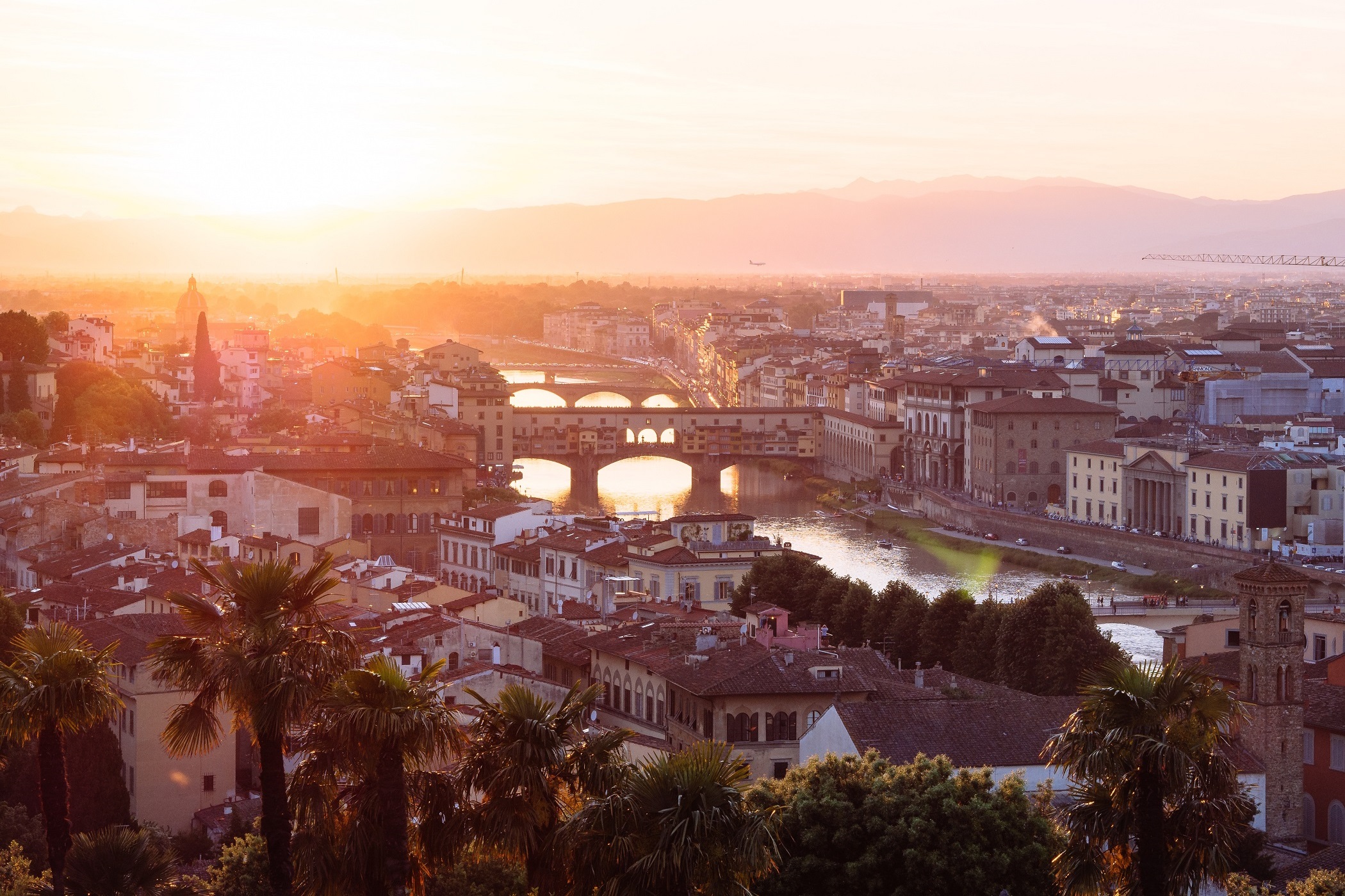

Hello all, Over the past few weeks Sonia and I have begun to focus more of our efforts on the actual user interface aspects of the project. When we meet with Paul in the IQ center he constantly encourages us to think about the technicalities of the program’s design, and what we can do to make it easier to use and improve the user’s experience. Paul, Sam and Aidan used the maps that we layered to construct a 3D version that accurately depicts the layout of Florence, which is very useful for us to see what the program looks like as we make progress. We have thus been able to go into VR while working through problems and making decisions. We spent several meetings focusing on the best way for the user to engage with the buildings and artworks. Paul explained to us the importance of trigger events to achieve different things in VR, and we spent some time looking at other VR programs to see what our options were and to weigh the strengths and weaknesses of each, particularly as it pertains to our project. We decided that an approach that forces the user to take specific actions to gain access to the information was important, because there needs to be some way to make sure the user knows what he or she is doing. That is, we want the user to be able to successfully navigate the program to access information, as opposed to stumbling upon buildings and not really understanding what they’re doing.
Paul helped us develop an example of this on the model. Here’s how it now works: As the user walks through the streets, significant buildings are colored differently than the others to identify the buildings we have modeled that can be explored. Once the user enters a specific perimeter surrounding the highlighted building, a high-resolution model of the building appears (low-resolution models are necessary otherwise to ensure the speed isn’t affected by too much data on the screen). Once this happens, a shaded area appears next to the building to indicate the location at which information can be obtained. Inside this area, an overview of the building is displayed in text, and the user can learn about the particular building before going inside the model.
One of the features we are excited to add once we’ve developed the program further is one that enables the user to go on virtual tours throughout the city, which essentially provides them with a checklist of things to do before they finish. This will lend itself especially useful to classes that will want to use the program, because professors can tailor each individual tour depending on who the target user will be. For instance, when a class is learning about works of art the Medici family commissioned, the professor can assign a homework project that requires students to use the VR to go look at certain artworks. The student must then read all of the information about each of the works on the list in order to receive credit for doing the assignment.
In her recent blog posts, Sonia has touched on some of the limitations of using 3D for such an extensive project, which include instances in which the user might want an interface that is more useful for reading articles about the building and conducting in-depth research. We now feel that our 2D map may be a good place to start working on that project, with an eye towards imitating the format of other maps, such as this Map of London created by a group at the University of Victoria https://mapoflondon.uvic.ca/. In an effort to start this, I spent a few hours last week with Professor Bent deciphering an old handmade map of Florence and labeling our own computerized map with Adobe Illustrator. This gave us a much better idea of which guilds and families were concentrated in the center of the city, and will hopefully provide a starting point from which we can dive into the project of assembling documents and resources on the different buildings.